Entrepreneurs work in an environment of extreme uncertainty; therefore, they undergo a long process of ITERATION. Startups are small businesses that don't have a set plan, they learn to steer and once they have a solid foundation they take a step forward and accelerate. During the steering period they are very flexible because if they take a wrong turn they have the tools and mindset to take a different path until they find success, a solid foundation.
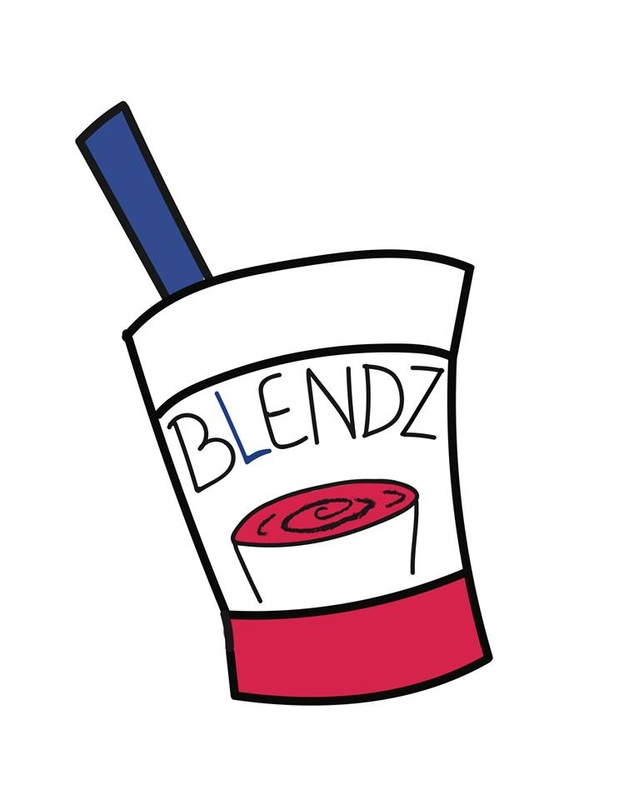
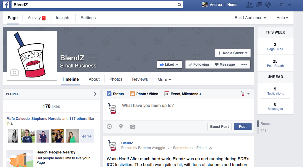
Not only has the entire BLENDZ company gone through ITERATION with the product, but within the marketing team alone we have ITERATED many times. One of our BIGGEST challenges has been to create the logo. When we first started to create it, we thought it was going to be an easy task. We were completely wrong about that. Creating the logo has taken a long time and it has delayed us in many ways; however, just like an MVP we also launched a first version of our logo, who Stefan and Sara created, in our prototyping day in ICC, in our Facebook page and in the website. The physical appearance of BLENDZ can be modified and improved as time goes by, this is why it's smart to show off to the public the different drafts of the image of BLENDZ. By making our drafts visual to the public we will receive feedback and make further modifications. Nonetheless, it is important to only make few drafts because otherwise we will confuse the customer and they won't know how to identify BLENDZ anymore.
Not only has the entire BLENDZ company gone through ITERATION with the product, but within the marketing team alone we have ITERATED many times. One of our BIGGEST challenges has been to create the logo. When we first started to create it, we thought it was going to be an easy task. We were completely wrong about that. Creating the logo has taken a long time and it has delayed us in many ways; however, just like an MVP we also launched a first version of our logo, who Stefan and Sara created, in our prototyping day in ICC, in our Facebook page and in the website. The physical appearance of BLENDZ can be modified and improved as time goes by, this is why it's smart to show off to the public the different drafts of the image of BLENDZ. By making our drafts visual to the public we will receive feedback and make further modifications. Nonetheless, it is important to only make few drafts because otherwise we will confuse the customer and they won't know how to identify BLENDZ anymore.
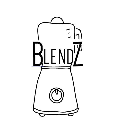
Stefan has been working on the logo for a long time, the first version of the logo looks nothing like he one now because it has gone through tons of ITERATION. Throughout the process I've been giving Stefan feedback as well as Mr. Topf and the CEO's. However, one day Mr. Topf realized that we were not maximizing our productivity because we were already a few weeks into the business and still no logo. Instead of changing the same logo into different things the most effective solution was to create several designs. These designs would be pitched to the company, and once we all agreed on the design the marketing team could work with that idea and make some more designs, with a similar concept. So on Monday Stefan got the opportunity to present some designs he had made, I also got the chance to present the two designs I came up with. It was hard to come to an agreement as a company, there is never going to be a design that we all agree 100% on, but we need to make sure that we chose and idea that we all like. While showing the ideas to our co-workers everybody started to talk and it got a little messy, so we made people give feedback on things they liked from the different designs. With all the feedback and comments we agreed that the best IDEA for the logo was SIMPLICITY. WHY simplicity? Because we wanted something playful, but easy that our customers can identify us with. Additionally, we also wanted a design that allowed modifications for special holidays and seasons. Finally as a company we also believed that the best idea was to have the name as part of the logo with a cool font.
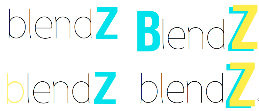
With all these ideas in mind Stefan and I begun to generate some quick sketches. Because we were so behind with the logo I put myself a goal, to have the logo done by the end of the day. In order to accomplish my goal I had to help Stefan out, since we decided that we wanted a flexible logo that allowed modifications during holidays and seasons we decided that we were going to keep the fruit, which was going to go in front of the "BLENDZ". So to divide and conquer Stefan took on the fruit challenge and I took on the text challenge. The day before, while I was creating my designs, I was experimenting with Illustrator and I loved it, so I decided to stick with it to create the logo. Believe it or not my hardest challenge was to select the font, yesterday I found a very cool page with millions of fonts. It was not only hard to chose one font from the infinite pond, but it was very challenging to find the perfect one. Remember, this is the physical appearance of BLENDZ, it has to be perfect. I had several people give me feedback about the font, it was hard because some people loved it and other didn't. I was extremely confused. To be more productive and get and idea down everybody got back to work and I worked on the logo by myself. Using some ideas Gise and DD gave me I managed to create six different designs. However, I didn't make major changes and used completely different themes for each design because otherwise this would make the decision harder. Instead, I stuck with one idea I thought was playful and simple and modified it to create six designs. Along with the designs I created options for color schemes, for this I used no more than two colors plus black.
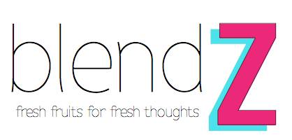
Once I was ready I showed it to Mr. Topf who gave me feedback and his thoughts about the logo. With him I agreed on four strong designs to show to the class. Finally we were on the right path. I felt extremely proud and excited of what I had created and it would't have been possible to come up with a logo without so many ITERATIONS, feedback and reflection. When I showed the designs to the class they were in love and I felt a HUGE relief inside me. I was so nervous that people weren't going to like it because I tried my best to create something simple and creative that all of us were going to agree. First we all voted, the winning design had 8 people so we agreed that that would be our logo. However, Gise suggested that the ones who voted for a different design had the right to speak up about their concerns with the chosen logo. While I was hearing all this feedback I made some modifications as my co-workers were watching. Finally to fine-tune and give a perfect closure we all voted on the color scheme. We all went for the pink and blue because these colors embrace the most the smoothie personality. I made the final adjustments, added the slogan on the bottom, and finally we had our logo. I was in love with it.
The process was bumpy, but I am extremely excited and proud of what us, as a company, managed to create because we all had a say. I want to show off our new identity to the customers. I can perfectly see this logo as part of our cups, uniforms and even our stand. I finally was able to accomplish my goal and everything through ITERATION.
 RSS Feed
